

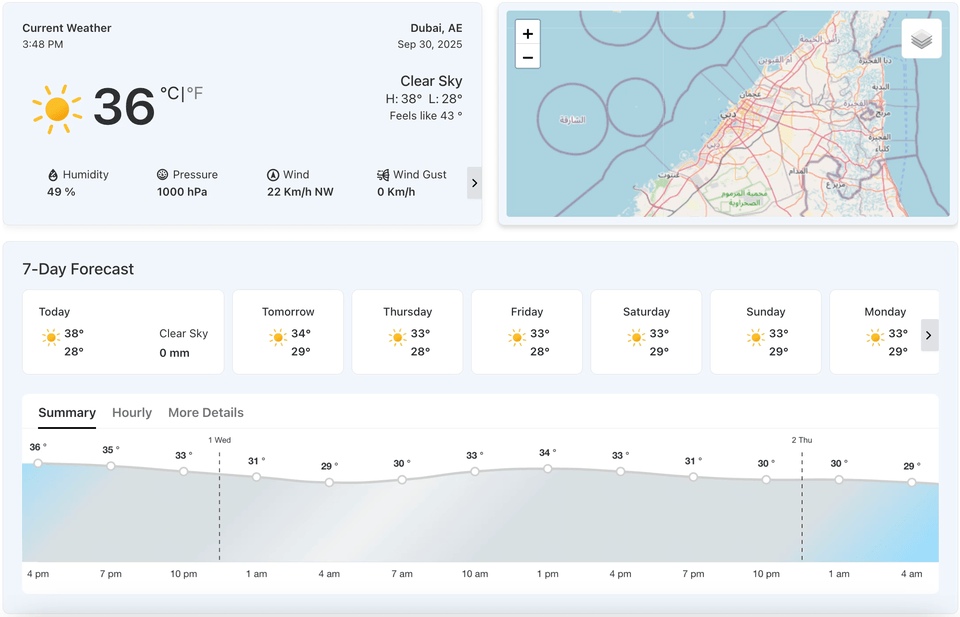
The Detailed Forecast block allows you to display a comprehensive weather report that includes daily and hourly forecasts. It provides a visual overview of current weather conditions, along with additional data and future projections. This block is designed to give your users a complete weather picture in a single, well-organized view.
Detailed Forecast Block – Key Features
- Comprehensive Display: The block displays a combination of a current weather summary and a detailed forecast in a single view.
- Live Weather Data: It shows real-time weather information, including the current temperature, “feels like” temperature, and daily low and high temperatures.
- Additional Insights: The block provides supplemental data such as humidity, pressure, and wind speed.
- Forecast Breakdown: It presents both daily and hourly forecasts.
- Customization: You can customize various aspects of the block, including its measurement units, maps, and the specific weather data that is displayed.
Using the Detailed Forecast Block
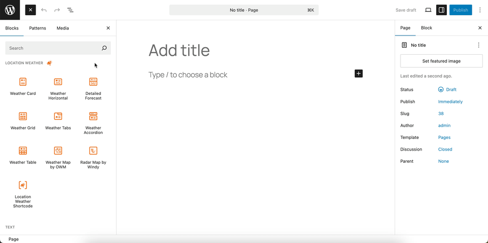
- Go to any WordPress page or post you’re editing.
- Click the ‘+’ button to add a new block.
- Search for “Weather Detailed Forecast” or find it under “LOCATION WEATHER.”
- Click it to add it to your page.
You can instantly see the live Preview of your customization. Once you’re happy with the design, click Publish or Update.
Let us explore the Detailed Forecast Block
Detailed Forecast Templates – General Settings
This section allows you to choose from various pre-designed templates for the Detailed Forecast block. This provides a quick and easy way to change the overall layout and design of your weather forecast display.
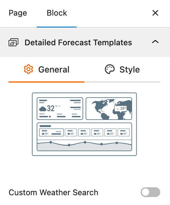
- Select a Template: Choose a template from the available designs to apply a new layout to your Detailed Forecast block instantly. Currently, one template is available.
- Custom Weather Search: A toggle to enable a search bar so users can instantly find and view the weather for any location.
Detailed Forecast Templates – Style Settings
This section gives you control over the visual appearance of the selected Detailed Forecast template. It allows you to customize the typography and color of the text to ensure the block is visually consistent with your website’s design.
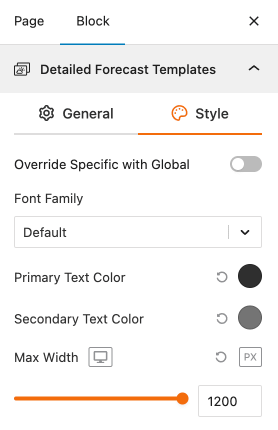
- Override Specific with Global: A toggle to use global styling settings for the block.
- Font Family: A dropdown to select the font family for the text within the block.
- Primary Text Color: A color picker to set the primary text color.
- Secondary Text Color: A color picker to set the secondary text color.
- Max Width: A slider to set the maximum width of the entire weather block.
Set Location Settings
This section lets you define which location’s weather data will be displayed in your weather view. You can choose a fixed location or let the system automatically detect the visitor’s location for real-time accuracy. For more details, visit this link.
Measurement Units Settings
This section allows you to customize the units used to display weather data in the Location Weather block. You can choose the standard units that best suit your target audience and location. For more details, visit this link.
Regional Preferences
This section allows you to set the display format for the weather location name, time, and date, as well as the time zone and language. For more details, visit this link.
Current Weather
This section allows you to customize the specific weather information you want to display, such as the temperature, weather conditions, and wind speed. You can toggle these elements on or off to create a simple or detailed weather display. For more details, visit this link.
Additional Data
This section gives you complete control over the supplemental weather information you want to display in your block. You can choose from various data points and customize their layout to provide a detailed weather overview for your visitors. For more details, visit this link.
Forecast Data
This section allows you to enable and configure the display of weather forecast information. You can choose what forecast data to show, how it is displayed, and for what time period. For more details, visit this link.
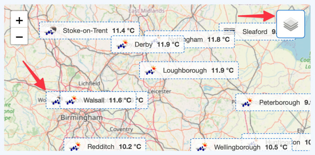
Weather Map Preferences – General Settings
This block section is designed for configuring how weather information is displayed on a map. It allows you to customize the data source, visual style, and interactive behavior of the weather map.
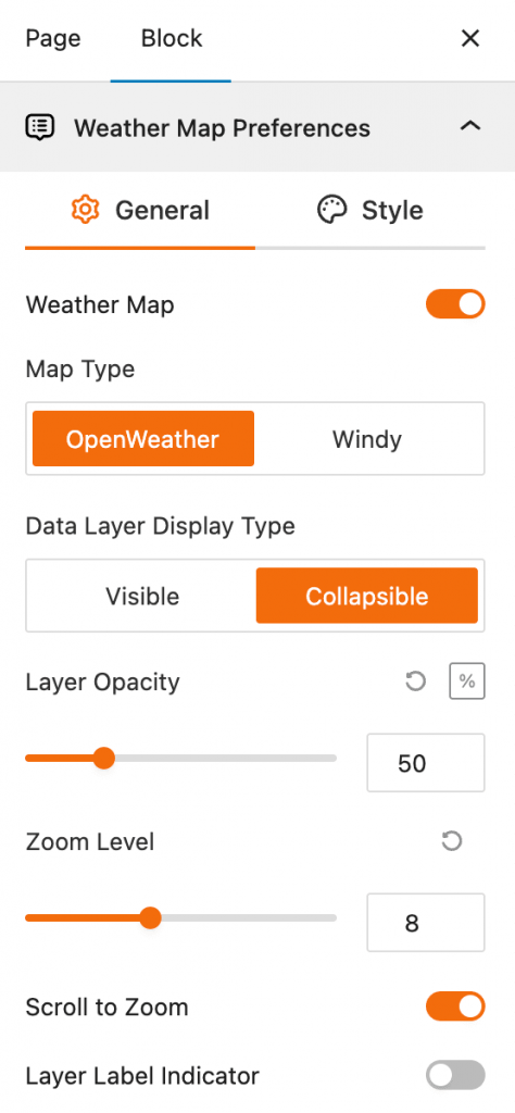
- Weather Map: This toggle controls the visibility of the weather map. When turned on, the weather map layer will be visible; when off, it won’t be displayed.
- Map Type: This setting lets you choose the data provider for the weather information. You can select between OpenWeather and Windy to determine the source of the weather data layers.
- Data Layer Display Type: This option affects how the data layers are shown on the map.
- Visible: The weather data layers are always on and visible.
- Collapsible: The weather data layers are initially visible but can be hidden or shown by the user.
- Layer Opacity: This slider controls the transparency of the weather data layer. A value of 50 (as shown in the screenshot) means the layer is semi-transparent, allowing you to see the base map underneath. You can adjust this from 0 to 100%.
- Zoom Level: This feature allows you to set the default zoom level of the map when it first loads. The value of 8 (as shown) represents a moderate zoom that shows a good amount of detail while still covering a broad area.
- Scroll to Zoom: This is a toggle that enables or disables zooming the map using the mouse scroll wheel.
- Layer Label Indicator: This toggle controls whether labels or indicators for the different weather layers are displayed on the map.
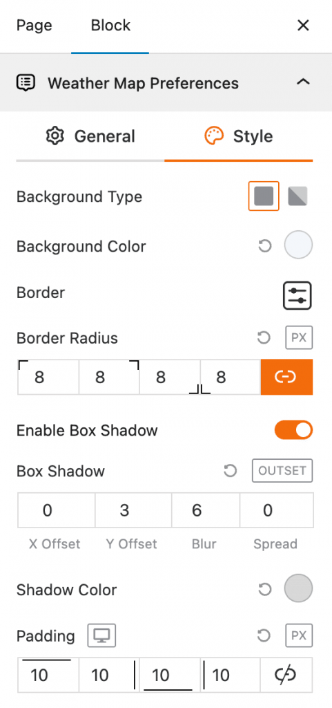
Weather Map Preferences – Style Settings
This block section is designed for configuring the visual style and appearance of the weather map block. It allows you to customize its background, borders, shadows, and spacing to match the overall design of your interface.
- Background Type: This setting allows you to choose the style of the block’s background, with options for a solid color or a gradient.
- Background Color: This feature lets you select the specific color for the background of the weather map block using a color swatch.
- Border: This option provides controls to add and customize a border around the block.
- Border Radius: This setting allows you to adjust the roundness of the block’s corners, with individual control for each corner in pixels (px).
- Enable Box Shadow: This toggle enables or disables a shadow effect that appears around the outside of the block.
- Box Shadow: When enabled, these fields let you customize the shadow’s horizontal and vertical position (X/Y Offset), its softness (Blur), and its size (Spread).
- Shadow Color: This feature allows you to select the color of the box shadow using a color swatch.
- Padding: This setting controls the inner spacing between the content and the border of the block, with the option to set different values for the top, right, bottom, and left sides.
Control Layers – General Settings
This block section is designed for controlling which weather data layers are available to be displayed on the map. It allows you to enable or disable specific weather data types and set a default layer.
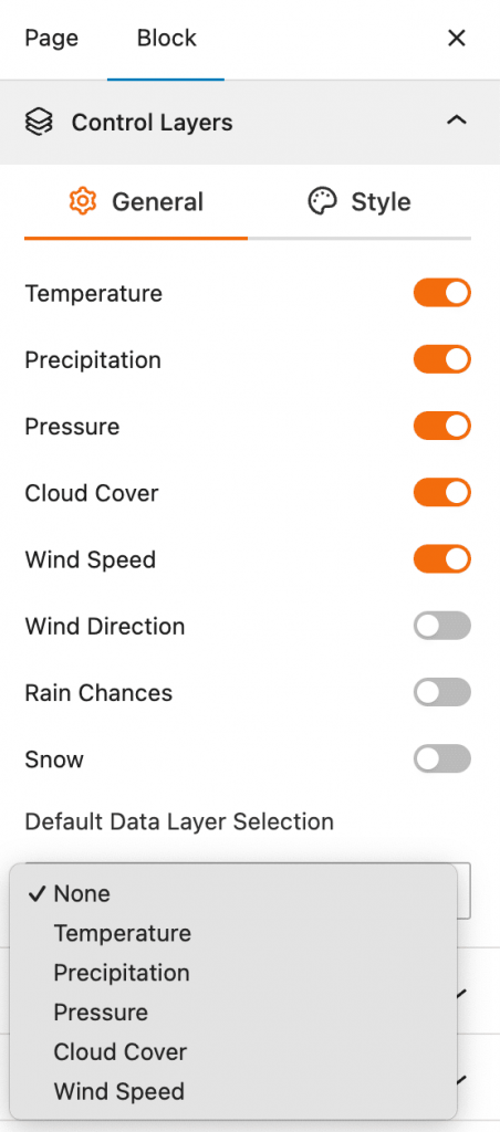
- Temperature: This toggle controls the visibility of the temperature data layer on the weather map. When turned on, users can see temperature information.
- Precipitation: This toggle allows you to show or hide the precipitation data layer, which displays information about rainfall.
- Pressure: This toggle enables or disables the atmospheric pressure data layer, providing a visual representation of high and low-pressure systems.
- Cloud Cover: This toggle controls the display of the cloud cover data layer, which shows the amount of cloudiness in a given area.
- Wind Speed: This toggle enables or disables the wind speed data layer, showing how fast the wind is blowing.
- Wind Direction: This toggle controls the display of the wind direction layer, which uses arrows or other indicators to show which way the wind is blowing.
- Rain Chances: This toggle allows you to enable or disable a layer that shows the probability of rain.
- Snow: This toggle controls the visibility of the snow data layer, which highlights areas where snow is occurring or predicted.
- Default Data Layer Selection: This dropdown menu lets you choose which of the enabled weather data layers will be active and visible on the map by default when the page loads.
Control Layers – Style Settings
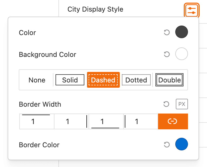
This block section is designed for customizing the visual style of the weather data layers and how city information is displayed. It allows for detailed control over the appearance of the map’s weather and location data.
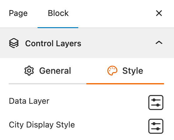
- Data Layer: Provides advanced style controls for the weather data layers.
- City Display Style: Allows you to customize how city names and markers are displayed on the map.
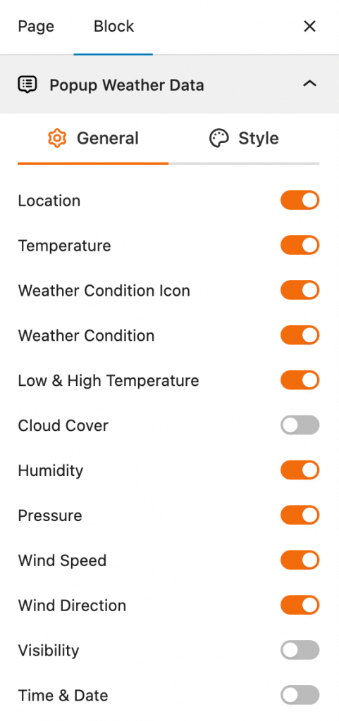
Popup Weather Data – General Settings
This block section allows you to control which pieces of weather data are displayed in the popup when a user interacts with the map. You can customize the information shown for a specific location by enabling or disabling various data options.
- Location: This toggle enables or disables the display of the location name in the popup.
- Temperature: This toggle controls whether the current temperature is shown in the popup.
- Weather Condition Icon: This toggle enables or disables the display of an icon representing the current weather conditions.
- Weather Condition: This toggle controls whether a text description of the weather condition (e.g., “Clear,” “Partly Cloudy”) is shown.
- Low & High Temperature: This toggle enables or disables the display of the daily low and high temperatures.
- Cloud Cover: This toggle controls whether information about cloud cover is included in the popup.
- Humidity: This toggle enables or disables the display of humidity levels.
- Pressure: This toggle controls whether the atmospheric pressure is shown.
- Wind Speed: This toggle enables or disables the display of the wind speed.
- Wind Direction: This toggle controls whether the direction of the wind is shown.
- Visibility: This toggle enables or disables the display of visibility distance.
- Time & Date: This toggle controls whether the current time and date for the selected location are shown in the popup.
Popup Weather Data – Style Settings
This block section allows you to control the visual style of the weather data popup. You can customize the colors, borders, and shadows of the popup window that appears when a user clicks on the map.
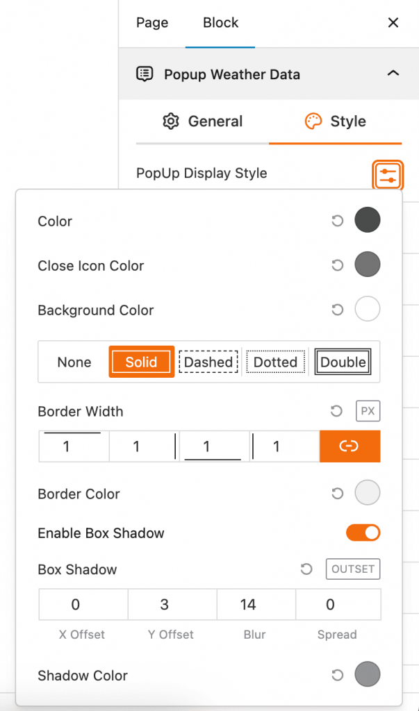
- Popup Display Style: This is the main section for styling the popup. Clicking the icon opens a list of styling options.
- Color: This setting controls the primary text and icon color within the popup.
- Close Icon Color: This setting allows you to choose the color for the close button icon of the popup.
- Background Color: This feature lets you select the background color of the popup window itself.
- Border: This section provides various border styles for the popup, including None, Solid, Dashed, Dotted, and Double.
- Border Width: This setting controls the thickness of the popup’s border, with separate input fields to set the width for each side (top, right, bottom, left) in pixels (px).
- Border Color: This feature allows you to select the color for the popup’s border.
- Enable Box Shadow: This toggle enables or disables a shadow effect around the popup.
- Box Shadow: When enabled, these fields let you customize the shadow’s horizontal and vertical position (X/Y Offset), its softness (Blur), and its size (Spread). The “OUTSET” label indicates the shadow is on the outside.
- Shadow Color: This feature allows you to select the color of the box shadow.
Advanced Settings
This section allows you to control the visibility of the block across different device types. You can choose to show or hide the block on desktops, tablets, or mobile devices to optimize the user experience for each screen size. For more details, visit this link.