

Display live weather updates in a stylish, interactive vertical card layout that comes with 6 pre-designed templates. Perfect for presenting current weather conditions in a compact card format.
Weather Card Block – Key Features
- Compact Layout – Display current weather conditions in a stylish, vertical card format.
- Live Weather Updates – Fetch and show real-time weather data for any location.
- Pre-Designed Templates – Choose from multiple ready-to-use card templates for quick setup.
- Customizable Styles – Adjust colors, typography, and layout to match your site design.
- Location Flexibility – Show weather for a specific city, user’s location.
- Interactive Display – Clean card interface for quick, easy-to-read weather details.
- Responsive Design – Optimized for desktops, tablets, and mobile devices.
- Seamless Integration – Works smoothly inside WordPress block editor (Gutenberg).
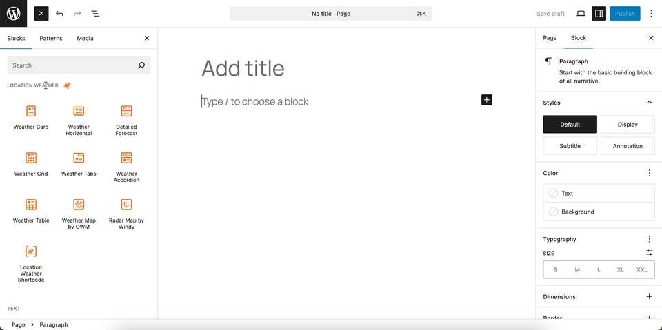
Using the Weather Card Block
- Go to any WordPress page or post you’re editing.
- Click the ‘+’ button to add a new block.
- Search for “Weather Card” or find it under “LOCATION WEATHER.”
- Click it to add it to your page and pick a starting card design.
You can instantly see the live Preview of your customization. Once you’re happy with the design, click Publish or Update.
Let us explore the Weather Card Block
Vertical Card Templates: General Settings
This section lets you choose from multiple pre-designed weather card layouts and control how the block behaves on your site.
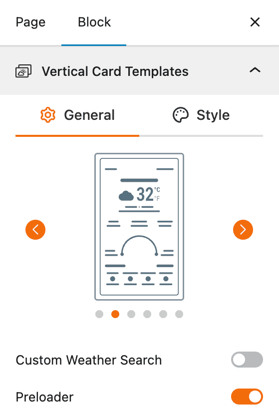
- Template Selector: Easily switch between different vertical card designs using the slider to find the one that fits your site’s style.
- Custom Weather Search: Enable this option to allow visitors to search and view weather for their own chosen location directly within the card.
- Preloader: Toggle the preloader on or off to show a loading animation while the weather data is being fetched, ensuring smoother interaction.
Let us explore the Custom Weather Search
Custom Weather Search – General Settings
The Custom Weather Search feature allows your users to search for and display weather information for a location of their choice. This gives your visitors a more interactive experience, letting them get a personalized weather forecast directly from your website.
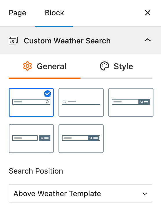
- Layouts: Choose from a variety of pre-designed search bar layouts.
- Search Position: Select where the search bar will be displayed relative to the weather block, such as “Beside Location Name” and “Above Weather Template”.
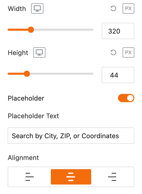
- Width and Height: Adjust the width and height of the search bar using sliders and input fields.
- Placeholder: Enable a placeholder text for the search bar.
- Placeholder Text: Customize the text that appears in the search bar when it is empty, such as “Search by City, ZIP, or Coordinates”.
- Alignment: Align the search bar to the left, center, or right.
Custom Weather Search – Style Settings
This section allows you to customize the appearance of the weather search bar’s input field, focusing on its typography, color, and spacing. This ensures the search bar integrates seamlessly with your website’s design.
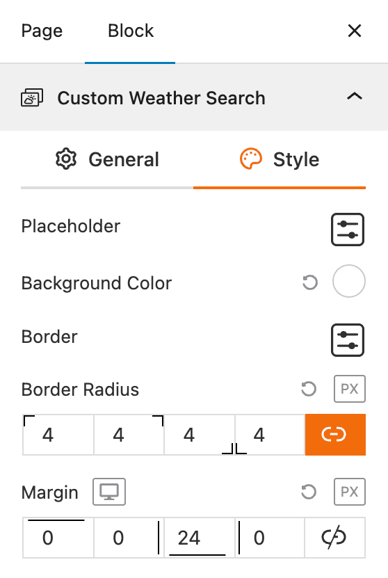
- Custom Weather Search Field: Provides a settings icon to open additional style options for the search input field.
- Typography: Offers a full range of typographic controls, including font family, size, style, and formatting.
- Color: Allows you to set the color of the text within the search field.
- Background Color: Enables you to set the background color of the search field.
- Padding: Adjusts the inner spacing of the search field.
- Margin: Adjusts the outer spacing around the search field.
Search Button – General Settings
This section allows you to customize the appearance of the search button within the custom weather search bar. You can easily adjust the icon and size to match your site’s design.
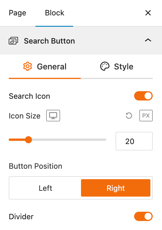
- Search Icon: Use this toggle to enable or disable the search icon within the search button.
- Icon Size: Adjust the size of the search icon in pixels (px) from here.
- Button Position: Set the search button’s position relative to the search field, either on the Left or Right.
- Divider: Use this toggle to enable a vertical line that visually separates the search button from the search input field.
Search Button – Style Settings
This section gives you control over the appearance of the search button within the custom weather search bar. You can customize its look for both normal and hover states to create a seamless user experience.
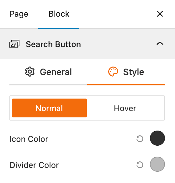
- Normal/Hover Tabs: Switch between styling options for the default (Normal) and mouse-over (Hover) states of the button.
- Icon Color: Adjust the color of the search icon inside the button.
- Divider Color: Change the color of the vertical line that separates the button from the search input field.
Vertical Card Templates: Style Settings
The section lets you fully customize the design and appearance of your weather cards to match your site’s branding and layout.
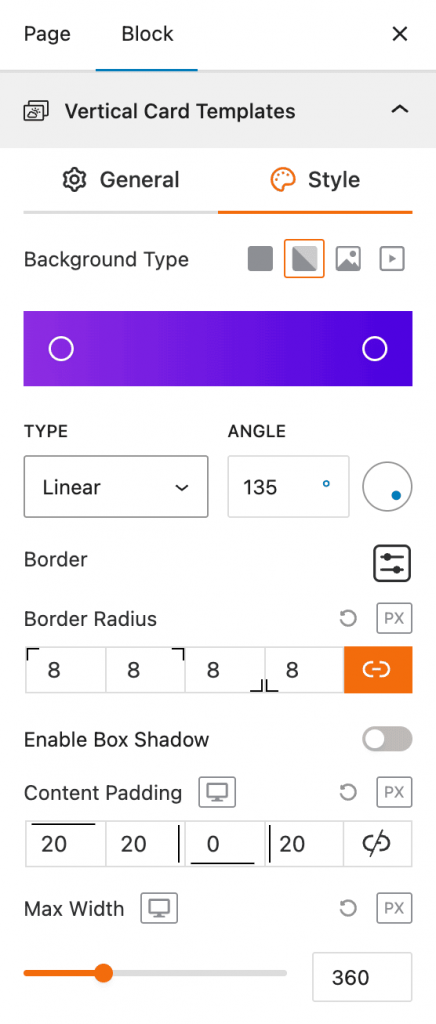
- Background Type: Choose between solid color, gradient, image, or video backgrounds for your card.
- Gradient Options: If using gradients, adjust the type (linear or radial) and control the angle for smooth color blending.
- Border & Border Radius: Define card borders and round the corners by setting custom radius values for each side.
- Box Shadow: Add depth to your card design with an optional shadow effect.
- Content Padding: Adjust inner spacing around the card content for better balance and readability.
- Max Width: Set the maximum card width to ensure it fits perfectly within your page layout.
Set Location Settings
This section lets you define which location’s weather data will be displayed in your weather view. You can choose a fixed location or let the system automatically detect the visitor’s location for real-time accuracy.
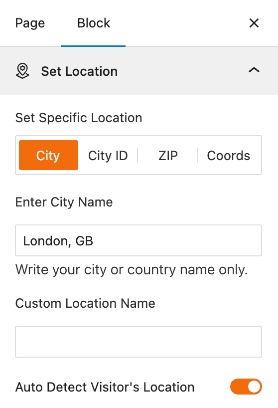
- Set Specific Location: Select the method to define your location — by City name, City ID, ZIP code, or Coordinates.
- Enter City Name: Input your desired city or country (e.g., London, GB) to display weather data for that location.
- Custom Location Name: Add a custom label to show instead of the default city name.
- Auto Detect Visitor’s Location: Enable this option to automatically detect and display the weather based on the visitor’s current location.
Measurement Units Settings
This section allows you to customize the units used to display weather data in the Location Weather block. You can choose the standard units that best suit your target audience and location.
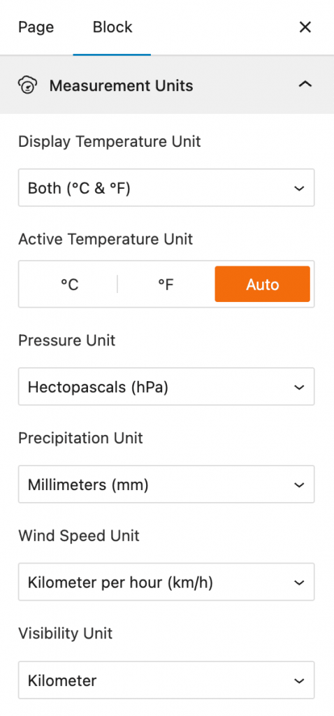
- Display Temperature Unit: Select whether to show temperature in Celsius (°C), Fahrenheit (°F), or both.
- Active Temperature Unit: Set the primary temperature unit to be displayed, with an option to have it automatically detected.
- Pressure Unit: Choose the unit for atmospheric pressure, such as Hectopascals (hPa).
- Precipitation Unit: Select the unit for rainfall or other precipitation, such as Millimeters (mm).
- Wind Speed Unit: Define the unit for wind speed, such as Kilometers per hour (km/h).
- Visibility Unit: Set the unit for visibility distance, such as Kilometers.
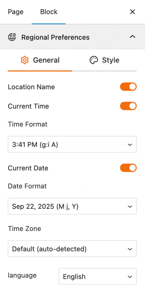
Regional Preferences: General Settings
This section allows you to set the display format for the weather location name, time, and date, as well as the time zone and language.
- Location Name: A toggle to show or hide the name of the weather location.
- Current Time: A toggle to show or hide the current time for the location.
- Time Format: A dropdown menu to select the format in which the time is displayed, such as 3:41 PM.
- Current Date: A toggle to show or hide the current date.
- Date Format: A dropdown menu to select the format for displaying the date, such as “Sep 22, 2025”.
- Time Zone: A dropdown menu to select the time zone, with an option for auto-detection.
- Language: A dropdown menu to select the language for the text displayed in the block.
Regional Preferences: Style Settings
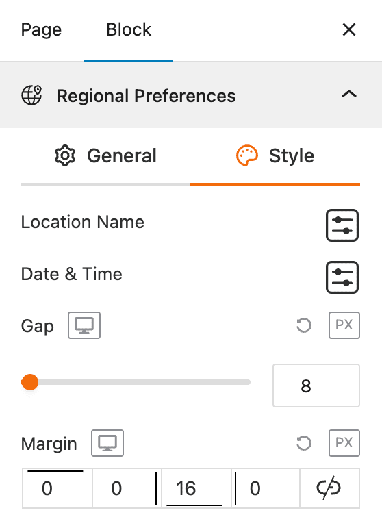
This section gives you control over the styling of the displayed location, date, and time elements, allowing you to match the block’s appearance with your website’s design.
- Location Name: Provides a settings icon to open additional style options for the location text.
- Date & Time: Provides a settings icon to open additional style options for the date and time text.
- Gap: Adjusts the empty space between the location, date, and time elements.
- Margin: Controls the outer spacing around the entire regional preferences block.
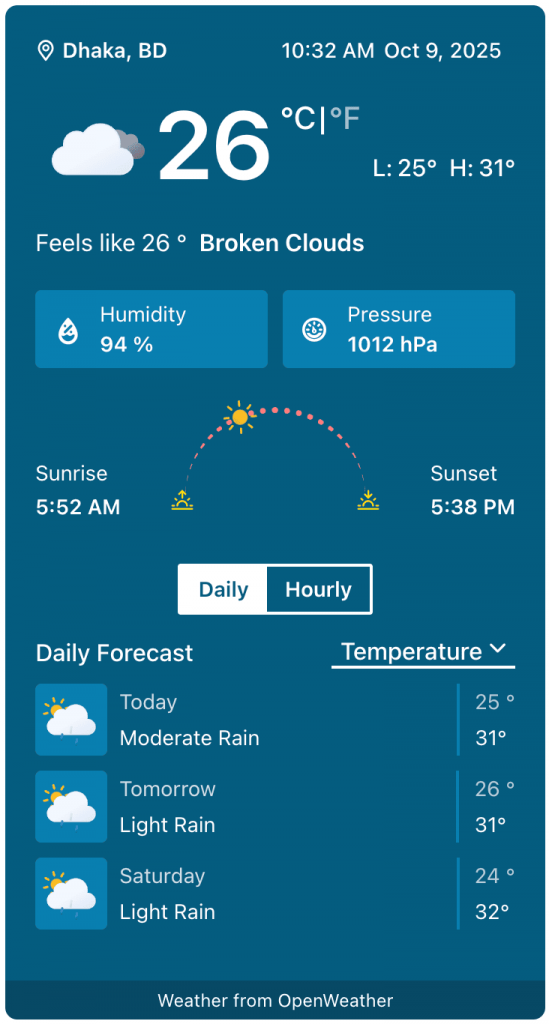
Current Weather: General Settings
This section allows you to customize the specific weather information you want to display, such as the temperature, weather conditions, and wind speed. You can toggle these elements on or off to create a simple or detailed weather display.
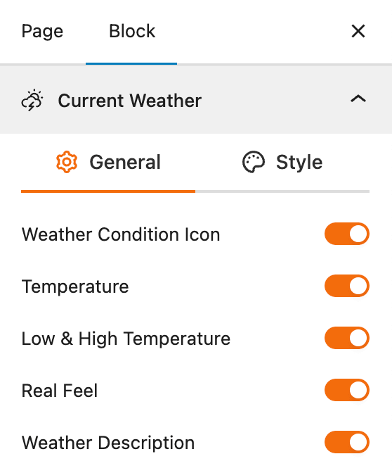
- Weather Condition Icon: A toggle to show or hide a visual icon representing the current weather conditions (e.g., sun, clouds, rain).
- Temperature: A toggle to show or hide the current temperature.
- Low & High Temperature: A toggle to show or hide the daily low and high temperatures.
- Real Feel: A toggle to show or hide the “feels like” temperature.
- Weather Description: A toggle to show or hide a text description of the current weather conditions.
Current Weather: Style Settings
This section gives you precise control over the styling of each current weather element, allowing you to customize their appearance to match your website’s design.
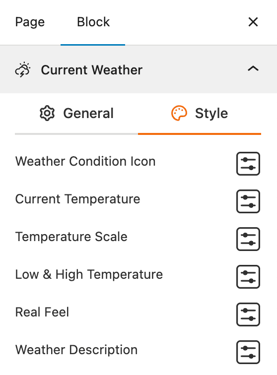
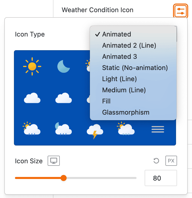
- Weather Condition Icon: Provides a settings icon to open additional style options for the weather icon, such as Icon Type and Size.
- Current Temperature: Provides a settings icon to open additional style options for the current temperature, such as typography and color.
- Temperature Scale: Provides a settings icon to open additional style options for the temperature unit (e.g., °C, °F).
- Low & High Temperature: Provides a settings icon to open additional style options for the daily low and high temperatures.
- Real Feel: Provides a settings icon to open additional style options for the “feels like” temperature.
- Weather Description: Provides a settings icon to open additional style options for the text description of the weather conditions.
Additional Data: General Settings
This section gives you complete control over the supplemental weather information you want to display in your block. You can choose from various data points and customize their layout to provide a detailed weather overview for your visitors.
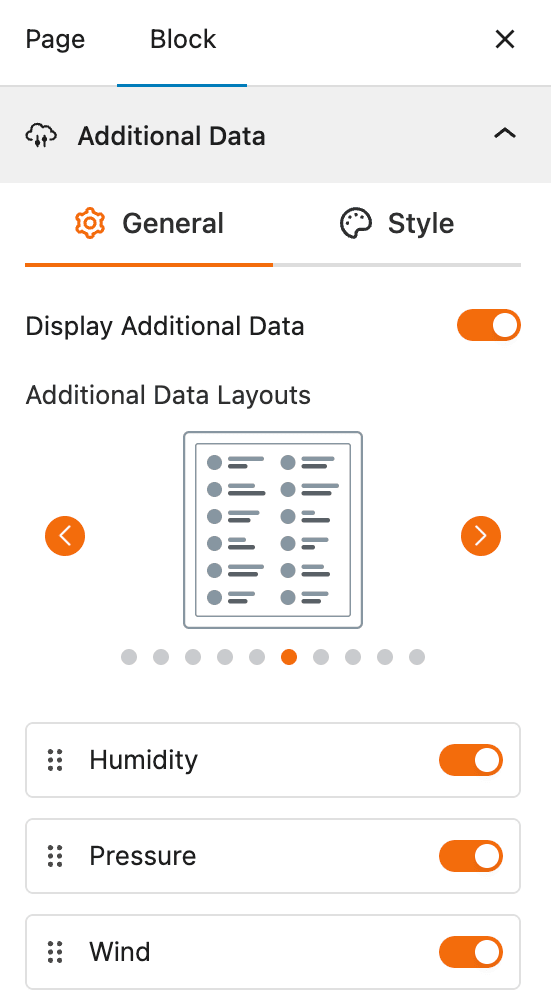
- Display Additional Data: A toggle to enable or disable the display of additional weather information.
- Additional Data Layouts: A selection of predefined layouts to choose how the additional weather data is arranged.
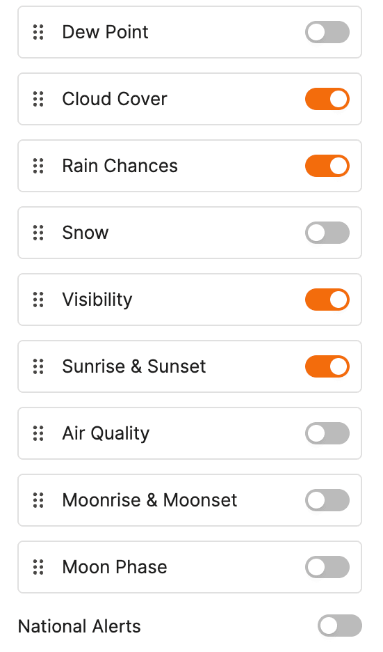
- Individual Data Toggles: A list of toggles to show or hide specific data points such as Humidity, Pressure, Wind, Dew Point, Cloud Cover, Rain Chances, Snow, Visibility, Sunrise & Sunset, Air Quality, Moonrise & Moonset, and Moon Phase.
Additional Data: Style Settings
This section provides control over the styling of each element within the Additional Data section. You can customize the appearance of icons, labels, and values to ensure they are visually consistent with your website’s design.
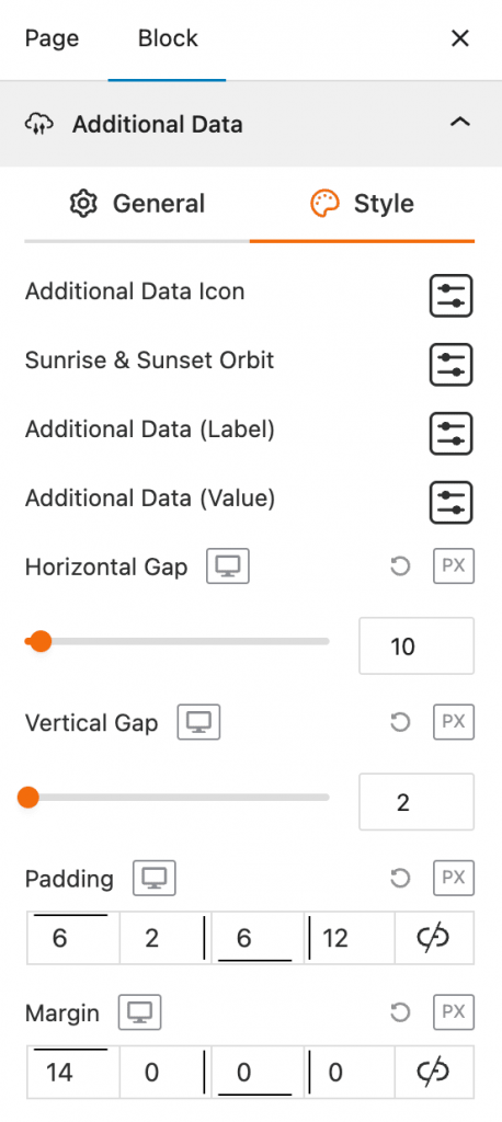
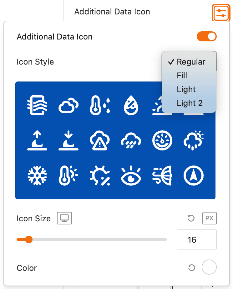
- Additional Data Icon: Provides a settings icon to open additional style options for the icon associated with each data point.
- Sunrise & Sunset Orbit: Provides a settings icon to open additional style options for the sunrise and sunset visual orbit.
- Additional Data (Label): Provides a settings icon to open additional style options for the text labels of each data point (e.g., “Humidity,” “Wind”).
- Additional Data (Value): Provides a settings icon to open additional style options for the actual data values (e.g., “80%,” “12 km/h”).
- Horizontal Gap: Adjust the horizontal spacing between the icon, label, and value.
- Vertical Gap: Adjust the vertical spacing between the different rows of additional data.
- Padding: Adjust the inner spacing around the additional data content.
- Margin: Adjust the outer spacing around the entire additional data block.
Forecast Data – General Settings
This section allows you to enable and configure the display of weather forecast information. You can choose what forecast data to show, how it is displayed, and for what time period.
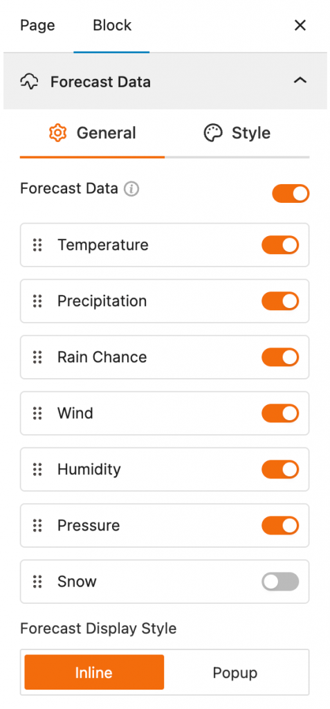
- Forecast Data: A toggle to enable or disable the display of forecast data.
- Individual Data Toggles: A list of toggles to show or hide specific data points such as Temperature, Precipitation, Rain Chance, Wind, Humidity, Pressure, and Snow.
- Forecast Display Style: Choose between an “Inline” display or a “Popup” display for the forecast data.
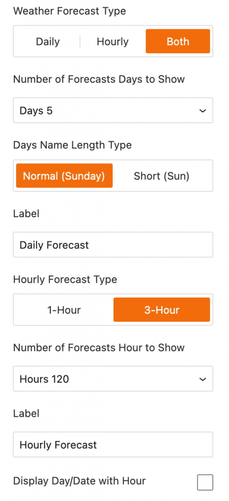
- Weather Forecast Type: Select whether to show a “Daily,” “Hourly,” or “Both” types of forecasts.
- Number of Forecast Days to Show: A dropdown to set how many days of the daily forecast to display.
- Days Name Length Type: Choose between a “Normal” (e.g., Sunday) or “Short” (e.g., Sun) display for the day names.
- Hourly Forecast Type: Select between “1-Hour” or “3-Hour” intervals for the hourly forecast data.
- Number of Forecasts Hour to Show: A dropdown to set how many hours of the hourly forecast to display.
- Display Day/Date with Hour: A toggle to show the day or date alongside the hour in the hourly forecast.
Forecast Data – Style Settings
This section gives you precise control over the styling of each element within the Forecast Data section. You can customize the appearance of icons, labels, and values to ensure they are visually consistent with your website’s design.
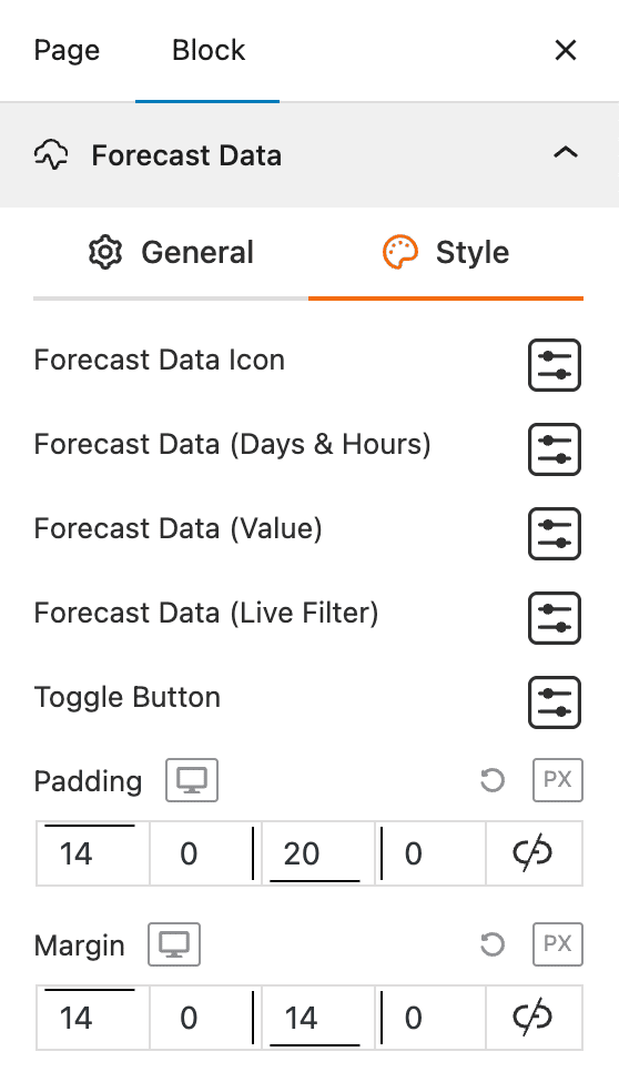
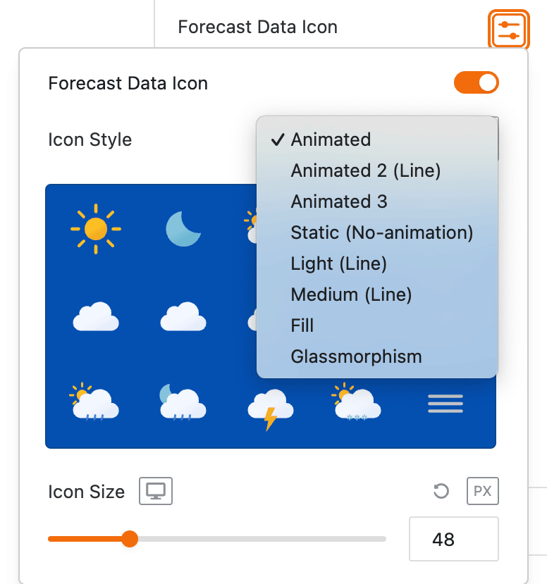
- Forecast Data Icon: Provides a settings icon to open additional style options for the icon associated with each data point.
- Forecast Data (Days & Hours): Provides a settings icon to open additional style options for the text showing the days and hours.
- Forecast Data (Value): Provides a settings icon to open additional style options for the actual data values (e.g., temperatures, wind speed).
- Forecast Data (Live Filter): Provides a settings icon to open additional style options for the live filter buttons that let users switch between daily and hourly forecasts.
- Toggle Button: Provides a settings icon to open additional style options for the toggle buttons used to switch between daily and hourly forecasts.
- Padding: Adjusts the inner spacing around the forecast data content.
- Margin: Adjusts the outer spacing around the entire forecast data block.
Footer – General Settings
This section allows you to control the display of information in the block’s footer, such as the data update time and weather attribution.
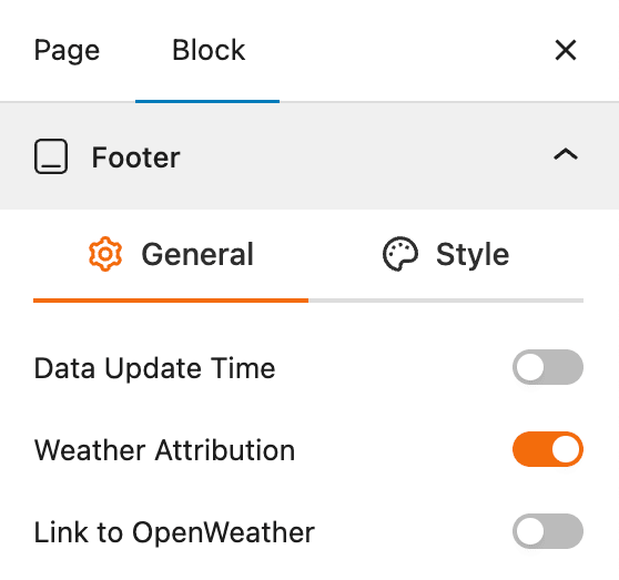
- Data Update Time: A toggle to show or hide the time the weather data was last updated.
- Weather Attribution: A toggle to show or hide the attribution to the weather data source.
- Link to OpenWeather: A toggle to link the weather attribution to the OpenWeather website.
Footer – Style Settings
This section allows you to customize the typography and appearance of the weather attribution text, ensuring it is styled to match your website’s design.
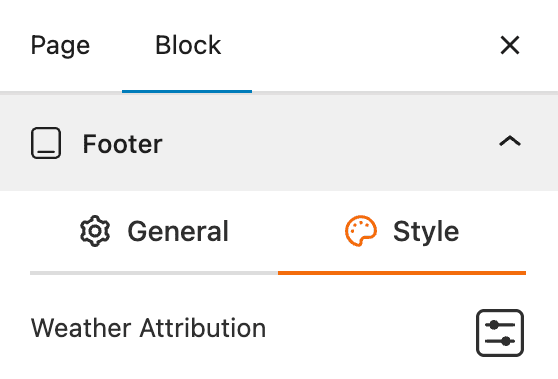
- Weather Attribution: Provides a settings icon to open additional style options for the weather attribution text.
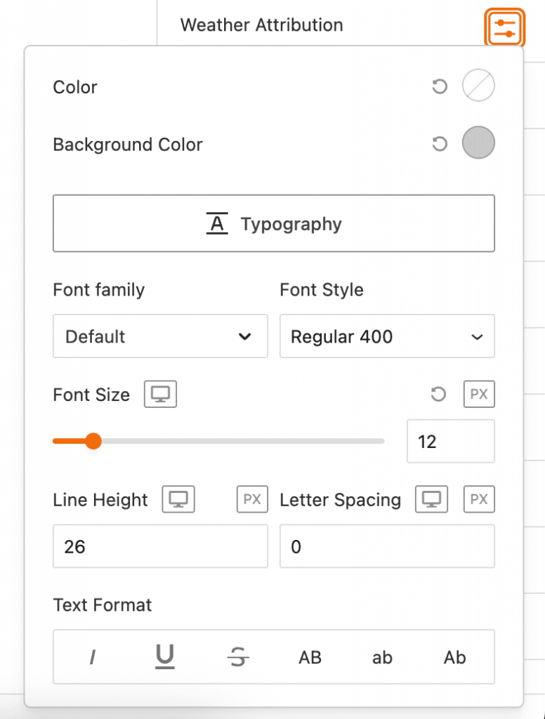
- Color: Changes the color of the attribution text.
- Background Color: Changes the background color behind the attribution text.
- Typography: Provides a full suite of options to change the font, size, style, and formatting of the text, including font family, font style, font size, line height, letter spacing, and text formatting.
Advanced Settings – Visibility
This section allows you to control the visibility of the block across different device types. You can choose to show or hide the block on desktops, tablets, or mobile devices to optimize the user experience for each screen size.
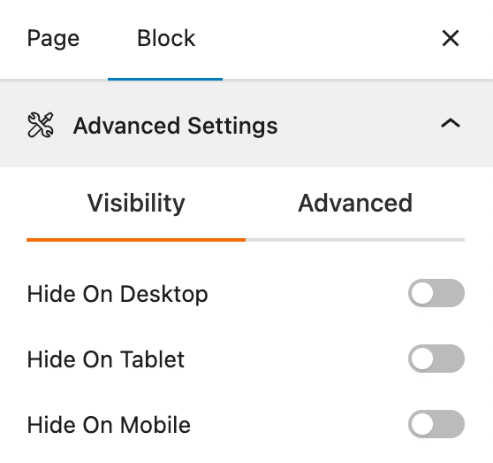
- Hide on Desktop: A toggle to hide the block on desktop screens.
- Hide on Tablet: A toggle to hide the block on tablet screens.
- Hide on Mobile: A toggle to hide the block on mobile screens.
Advanced Settings – Advanced
This section provides options to add custom CSS code and enhance the style of the block.
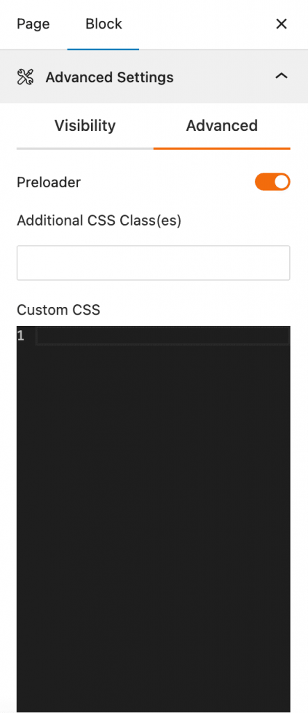
- Preloader: A toggle to enable a preloader animation that appears while the weather data is loading.
- Additional CSS Class(es): An input field to add custom CSS code to the block, allowing for more specific styling.
- Custom CSS: A code editor to add custom CSS rules directly to the block.