

The Weather Accordion Block allows you to display weather information within collapsible accordion sections. This block offers 4 pre-designed templates from which you can choose to present current weather, forecasts, or other data points in an organized, expandable format, saving space and improving user experience.
Weather Accordion Block – Key Features
- Collapsible Interface: The block displays weather information in a collapsible accordion format, which is excellent for saving vertical space on a page.
- Organized Data Display: Users can click on individual items in the accordion to expand and view detailed weather information for a specific day or hour.
- Clean and Compact: The accordion design keeps the initial view clean and simple, only revealing additional details when the user chooses to interact with them.
Using the Weather Accordion Block
- Go to any WordPress page or post you’re editing.
- Click the ‘+’ button to add a new block.
- Search for “Weather Accordion” or find it under “LOCATION WEATHER.”
- Click it to add it to your page and pick a starting accordion design (e.g., Template One, Template Two, etc.).
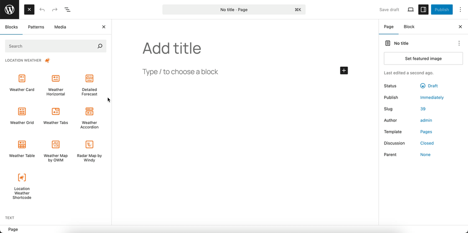
You can instantly see the live Preview of your customization. Once you’re happy with the design, click Publish or Update.
Let us explore the Weather Accordion Block
Accordion Templates – General Settings
This section allows you to select a pre-designed template for the Weather Accordion block. By choosing from a variety of layouts, you can easily change the look of your accordion to match your website’s design without any custom coding.
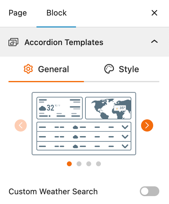
- Select a Template: A visual gallery of templates is presented, and you can simply click to choose the one you want to apply to your accordion.
- Custom Weather Search: A toggle to enable a search bar, which allows users to search for a location and display its weather forecast in the accordion format.
Accordion Templates – Style Settings
This section gives you control over the visual appearance of the selected Weather Accordion template. It allows you to customize the typography and color of the text to ensure the block is visually consistent with your website’s design.
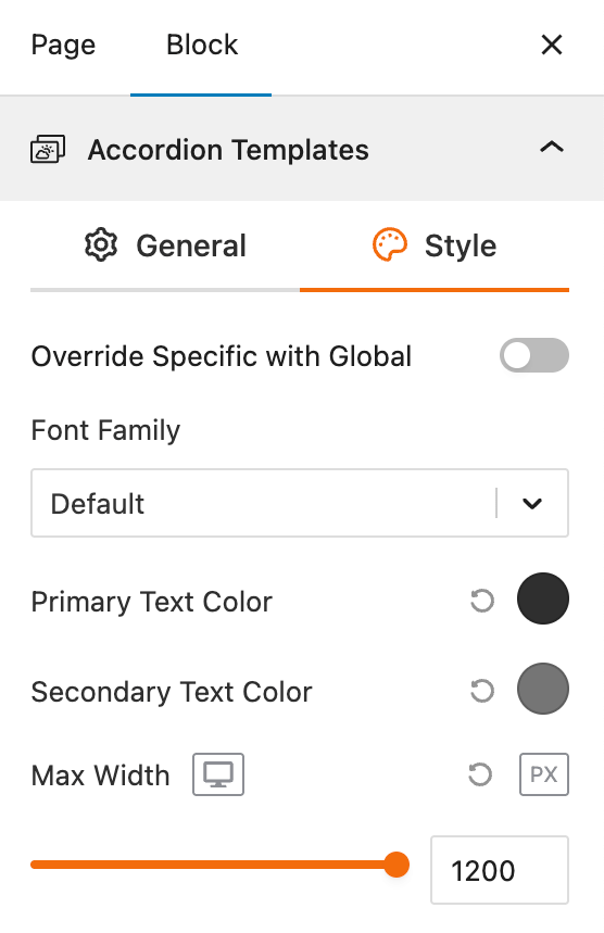
- Override Specific with Global: A toggle that enables overriding the block’s individual style settings with global theme styles, ensuring site-wide consistency without manual tweaks.
- Font Family: A dropdown selector for choosing the typeface used throughout the accordion elements, with “Default” inheriting from the theme for seamless integration.
- Primary Text Color: A color picker to define the main text color (e.g., accordion headers or key weather data), with an eyedropper tool for precise selection.
- Secondary Text Color: A color picker for accent text (e.g., descriptions or timestamps), allowing for subtle hierarchy in the weather display.
- Max Width: A numeric input (with pixel lock) to constrain the accordion’s maximum width, ideal for responsive layouts on larger screens.
Set Location Settings
This section lets you define which location’s weather data will be displayed in your weather view. You can choose a fixed location or let the system automatically detect the visitor’s location for real-time accuracy. For more details, visit this link.
Measurement Units Settings
This section allows you to customize the units used to display weather data in the Location Weather block. You can choose the standard units that best suit your target audience and location. For more details, visit this link.
Regional Preferences
This section allows you to set the display format for the weather location name, time, and date, as well as the time zone and language. For more details, visit this link.
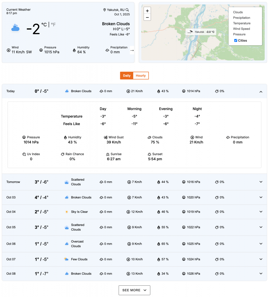
Current Weather
This section allows you to customize the specific weather information you want to display, such as the temperature, weather conditions, and wind speed. You can toggle these elements on or off to create a simple or detailed weather display. For more details, visit this link.
Additional Data
This section gives you complete control over the supplemental weather information you want to display in your block. You can choose from various data points and customize their layout to provide a detailed weather overview for your visitors. For more details, visit this link.
Forecast Data
This section allows you to enable and configure the display of weather forecast information. You can choose what forecast data to show, how it is displayed, and for what time period. For more details, visit this link.
Accordion Preferences – General Settings
This section allows you to customize the behavior and content of the Weather Accordion block. These settings give you control over how the accordion functions and the number of items it displays at once.
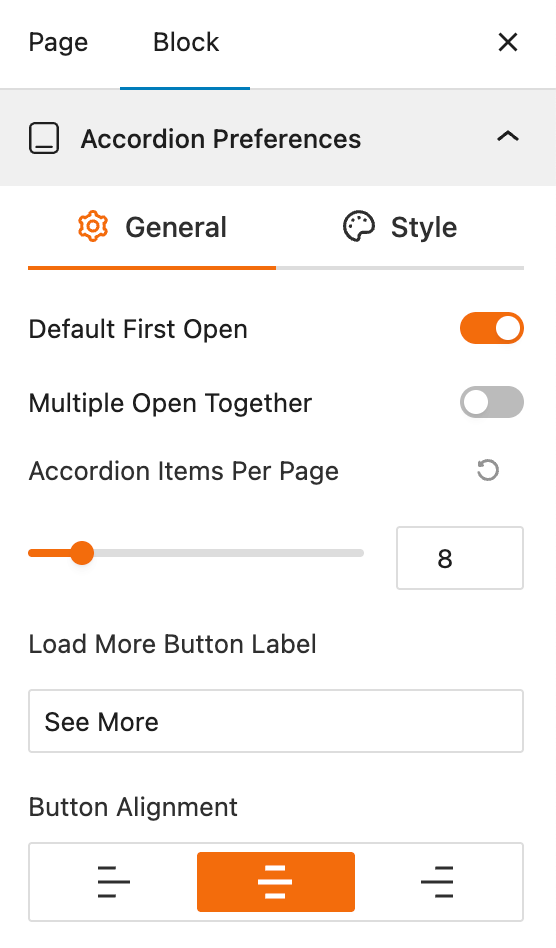
- Default First Open: A toggle to automatically open the first item in the accordion when the page loads.
- Multiple Open Together: A toggle that, when enabled, allows users to expand more than one accordion item at the same time.
- Accordion Items Per Page: A slider to set the number of accordion items to be displayed initially.
- Load More Button Label: An input field to customize the text of the button that reveals more accordion items.
- Button Alignment: Options to align the “Load More” button to the left, center, or right.
Accordion Preferences – Style Settings
This section gives you comprehensive control over the styling of the individual components within the weather accordion. You can customize the look of the toggle icons, titles, and other elements to create a cohesive and attractive design.
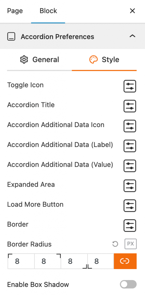
- Toggle Icon: This feature provides styling options for the icon that expands and collapses the accordion item.
- Accordion Title: This provides a settings panel for styling the title text of each accordion item.
- Accordion Additional Data Icon: This feature gives you styling control over the icons for any additional data displayed in the accordion.
- Accordion Additional Data (Label): This allows you to style the labels for the additional weather data.
- Accordion Additional Data (Value): This provides styling options for the numerical or textual values of the additional weather data.
- Expanded Area: This feature allows you to customize the styling of the content area that appears when an accordion item is expanded.
- Load More Button: Provides styling options for the “Load More” button, including its color, background, and other visual properties.
- Border: This provides settings for the border of the accordion, including its style and color.
- Border Radius: Input fields to set the corner roundness of the accordion’s borders.
- Enable Box Shadow: A toggle to add a shadow effect to the accordion block.
Weather Map Preferences
This block section is designed for configuring how weather information is displayed on a map. It allows you to customize the data source, visual style, and interactive behavior of the weather map. For more details, visit this link.
Control Layers
This block section is designed for controlling which weather data layers are available to be displayed on the map. It allows you to enable or disable specific weather data types and set a default layer. For more details, visit this link.
Popup Weather Data
This block section allows you to control which pieces of weather data are displayed in the popup when a user interacts with the map. You can customize the information shown for a specific location by enabling or disabling various data options. For more details, visit this link.
Advanced Settings
This section allows you to control the visibility of the block across different device types. You can choose to show or hide the block on desktops, tablets, or mobile devices to optimize the user experience for each screen size. For more details, visit this link.