

The Historical Weather Data block gives you access to decades of past weather records, allowing you to display historical conditions and long-term trends directly on your WordPress site. Based on your selected API type and plan, you can retrieve up to 46 years of historical data, making this block ideal for research, event planning, seasonal analysis, and climate insights.
Historical Weather Data – Key Features:
- Extensive Date Range: Fetch and display weather data from decades past (up to 46 years).
- Detailed Past Metrics: View historical temperature, wind speed, humidity, and atmospheric pressure.
- Trend Analysis: Ideal for comparing current weather patterns with historical averages.
- Responsive Layouts: Perfectly optimized for all screen sizes, ensuring historical data remains readable on mobile and desktop.
- Easy Filtering: Simple Location & Date filtering to fetch data for a specific day or period in history.
How to Create the Historical Weather Data Block:
- Navigate to the WordPress page or post you wish to edit.
- Click the (+) button to add a new block and search for “Historical Weather Data”.
- Click the block to add it to your page.
- Use the Block Settings sidebar to select your desired location and historical date.
- Check the Block Preview to see the data update in real-time.
- Once you have customized the style, click Publish or Update.
Let us explore the Historical Weather Data Settings:
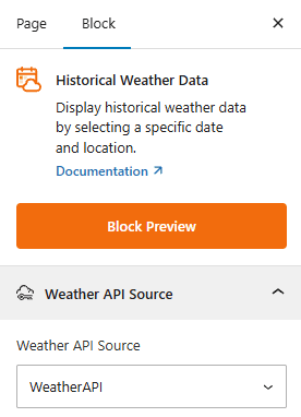
Weather API Source:
This section allows you to select the Weather API provider for your Historical Weather Data. Choose your provider (e.g., OpenWeather or Weather API) to fetch the historical weather records.
Historical Weather Templates: General
From this panel, you can choose pre-designed templates and location & date filtering with stylish presets.
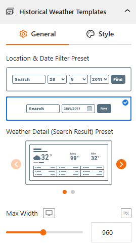
- Location & Date Filtering Preset: Select your preferred location & filtering preset from here.
- Select a Template: Find your preferred templates from 2 stylish designs.
- Max Width: Set the preset width to align with your content area from here.
Style Historical Weather Template:
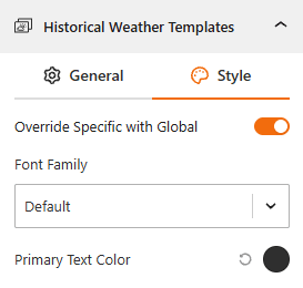
- Override Specific with Global: Toggle this to choose between global font styles and block-specific customizations.
- Typography: Dedicated panel to choose a custom font family as you need.
- Color: Set the primary text color from here.
Location & Date Filter: General
From this panel, you can configure the functional behavior of the Location & Date filter.
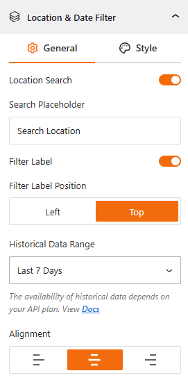
- Location Search: Toggle this ON to allow users to search by a specific city or region.
- Search Placeholder: Customize the text that appears inside the search bar (e.g., “Search Location” or “Enter a City”).
- Filter Label: Enable this to show a descriptive title for the filter. Set the position to the Left or at the Top of the input field.
- Historical Data Range: Choose the timeframe for the historical weather data you want show from the available range.
- Last 7 days
- Last 365 days.
- Last 3 years
- Last 5 Years
- Last 10 years
- Full Range (since 2010).
Note: The availability of historical data depends on your specific API plan.
- Alignment: Set the alignment of the search bar to the Left, Center, or Right of your layout.
Style Location & Date Filter:
From this panel, you can add style to the Location & Date search filter bar:
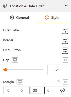
- Filter Label: Adjust typography, color, and size of the filter label from here.
- Border: Define the border color, style, width, and radius to create modern, rounded corners.
- Find Button: Style the “Search” button’s background color, text, and hover effects.
- Gap: Set the distance between the search inputs, such as date, month, year, and button.
- Margin: Set the external spacing around the search bar.
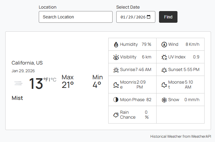
Weather Details (Search Result): General
From the General panel, you can set specific weather metrics to show or hide, and keep your search results as simple or as detailed as needed.
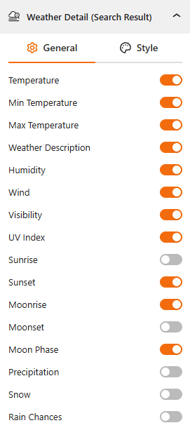
- Show/Hide Core Weather Metrics: Toggle this to enable or disable the standard Weather Data, like the Temperature, Min/Max Temperature, and Weather Description.
- Show/Hide Atmospheric Conditions: Use this toggle to enable or disable the visibility for Humidity, Wind speed, Visibility, and UV Index.
- Show/Hide Astronomical Data: Choose to show or hide solar and lunar cycles, including Sunrise/Sunset, Moonrise/Moonset, and the current Moon Phase.
- Show/Hide Precipitation: Use these specific toggles to enable or disable Precipitation, Snow, and Rain Chances.
Style the Weather Detail (Search Result):
From the styling tab, you can customize the visual of the search results for your weather detail.
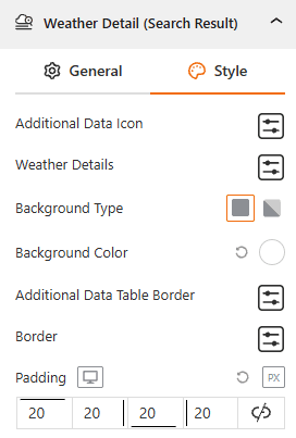
- Icons & Text: Choose the Additional Data Icon and set the typography of the Weather Details text.
- Background Type: Select Background as Classic or Gradient and set the color for the result card.
- Additional Data Borders: Style the Additional Data Border and the main container Border to create a clear separation between data points.
- Padding: Adjust the internal spacing to ensure your data isn’t touching the edges of the card.
Attribution:
This section allows you to control the display of information in the block’s footer, such as the data update time and weather attribution. For more details, visit this link.
Advanced Settings:
This section allows you to control the visibility of the block across different device types. You can choose to show or hide the block on desktops, tablets, or mobile devices to optimize the user experience for each screen size. For more details, visit this link.