
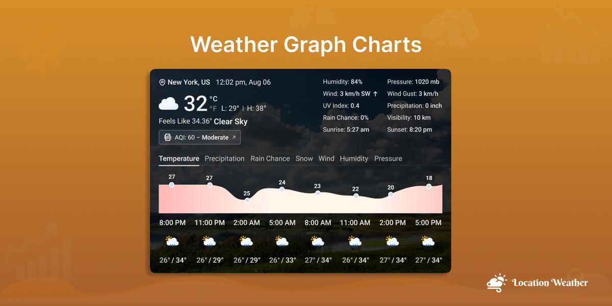
Did you know weather isn’t just about temperature — it’s about trends, visuals, and real-time updates? Using the Weather Graph Chart, you can now help visitors easily understand temperature changes, rainfall patterns, or weekly forecasts over a period of time at a glance.
If you own a Travel Blog, Local Service, Event Site, or Farming Advisory Platform, visualizing real-time weather data can make your content more interactive and informative. With the Location Weather plugin’s Weather Graph Chart features, you can show a live graphical weather display on your WordPress website while enhancing user experience.
In this blog, I’ll teach you how to show weather graph chart data with an easy-to-use toggle — no coding needed.
Let’s get started.
What Is a Weather Graph Chart?
The Weather Graph is a visual representation of weather data that displays changes in various weather elements, such as temperature, rainfall, humidity, wind speed, or pressure, over a specific period of time. It helps users quickly understand patterns, compare past and current weather conditions, and make informed decisions.
What’s the best part? We have integrated the weather graph with two popular styles (Line and Bar Graph) in our Location Weather plugin developed by ShapedPlugin.
Excited to know how they work for weather forecasting? Let’s explore!
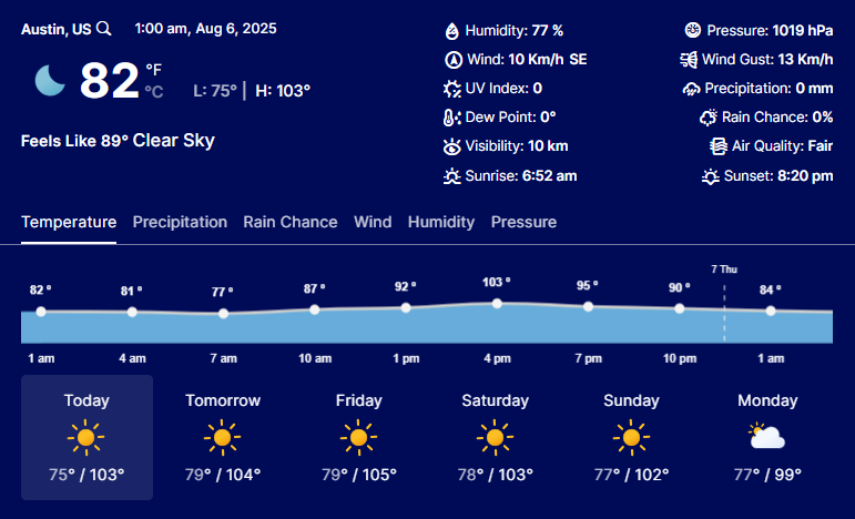
What Is a Line Chart in Weather Graphs?
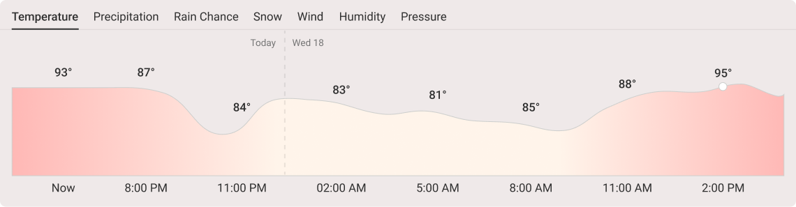
A Line Graph ( known as a Line Chart) is a great way to present any data visually and is used in weather forecasting to track changes in weather conditions over time. It effectively displays trends, patterns, and anomalies, making it easier to understand how temperature, rainfall, wind speed, and other variables change over short or long periods.
How Do Line Graphs Work in Weather Forecasting?
- Show Trends: Tracks temperature, rainfall, wind speed, pressure, and humidity over time.
- Spot Patterns & Anomalies: Identifies regular weather cycles and unusual events based on weather.
- Compare & Predict: Uses dual line graphs to compare related data sets (e.g., temperature vs. humidity).
What Is a Bar Chart in Weather Graphs?
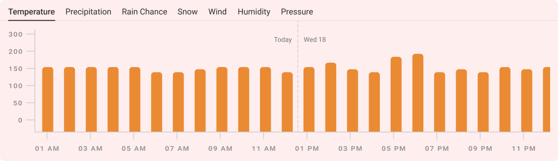
Another type of weather chart we used is the Bar Chart (also called a Bar Graph), which is a practical graphical way to present data. It is used in weather forecasting to represent quantities of various weather elements, especially precipitation such as rainfall or snowfall. It compares data across periods or locations, making it easier to visualize.
How Do Bar Charts Work in Weather Forecasting?
- Show Precipitation Levels: Displays rainfall or snowfall amounts (daily, monthly, or yearly), etc.
- Compare Regions or Seasons: Compares precipitation between different locations or time frames.
- Highlight Extremes: Shows the wettest or driest months, helping in the identification of seasonal patterns or climate shifts.
Who Can Benefit Most from Using Weather Graph Charts?
Any more? Weather graph charts are an excellent addition for a wide range of business owners and weather-related service providers who rely on accurate and visual weather data, including:
- Weather Enthusiasts & Bloggers – Track and visualize weather data with audiences in a more engaging way.
- Travel & Tourism Businesses – Inform customers about the seasonal weather for better planning and safety.
- Meteorologists & Forecasters – Help to analyze trends and predict weather using temperature, pressure, and wind data.
- Aviation & Maritime Industries – Assist in planning safer travel routes by tracking storms, wind speed, and visibility.
- Farmers & Agricultural Planners – Monitor rainfall, temperature, and humidity for better crop and irrigation decisions.
- Event Planners – Assist in preparing for outdoor events by understanding upcoming weather conditions.
- Teachers & Students – Perfect for educational projects and understanding climate data.
- Local Governments & Emergency Services – Help in disaster preparedness and weather-based response planning.
Why Displaying Weather Graphs Matters to Your WordPress Business?
Moreover, adding a graph or chart to your weather widget is more than just a visual bonus, as it allows for clear, visual insights while increasing your brand’s conversion even further. It makes significant impacts in several aspects, such as:
- Engage More Customers: Attractive and easy-to-understand weather data keeps visitors interested.
- Build Credibility: Reliable weather info boosts the brand’s trustworthiness.
- Enhance Decision-Making: Visual weather charts help customers plan more effectively (for booking trips, scheduling events, or shopping).
- Optimize Operations: Precise and interactive weather trends enable businesses to adjust inventory, staffing, and services effectively.
- Boost Brand Reputation: Real-time weather visuals make your site more dynamic and valuable.
- Increase Traffic & SEO: Fresh, interactive weather data improves SEO and encourages repeat visits.
How to Display the Weather Graph Chart on Your WordPress Weather Widget?
The Weather Graph Chart is one of the most visually appealing features of the Location Weather plugin. To display it in your weather view, follow the steps below:
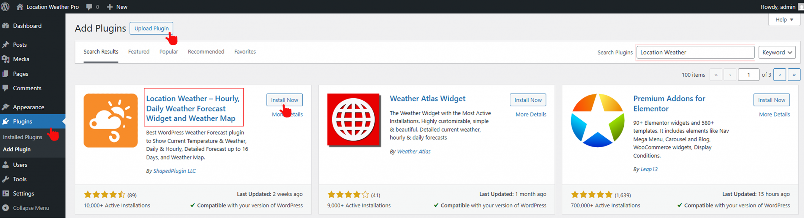
First: Download and Activate the Plugin
- Download the Location Weather plugin and activate it.
- However, if you’re a Newcomer (Future Master) to this plugin, follow our Step-by-Step Guide to install it. If you want to explore the free version, download the #1 WordPress Location Weather Plugin.
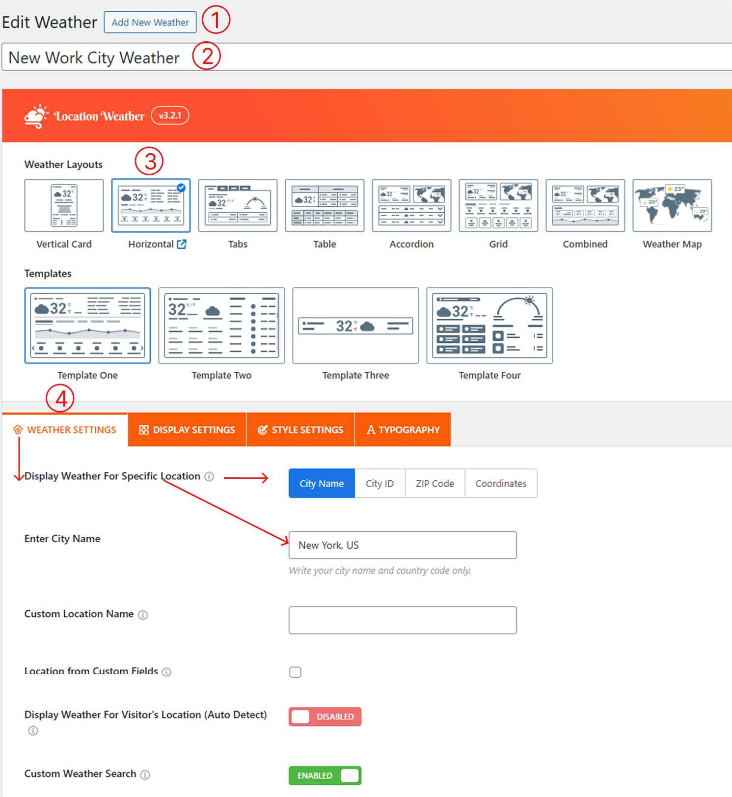
Second: Create a New Weather Widget
- From your WordPress Dashboard, go to Location Weather > Add New Weather.
- Enter a Title for the weather (e.g., “New York Weather“).
- Now, select either the Horizontal or Combined Weather Layout and choose Template One, as the Weather Graph chart is currently available for these two layouts.
- Move to the Weather Settings, select “Display Weather for Specific Location”, and enter your city location using:
- City Name (e.g., “Paris” or “New York”)
- City ID (specific to OpenWeatherMap database), Get city ID
- ZIP or Postal Code (e.g., “90210”), instructions
- Geographic Coordinates (Latitude & Longitude) (e.g., “40.7128, -74.0060”), Get coordinates
Third: Find the Weather Forecast Data Tab
- After the Weather Settings Tab, proceed to the Display Settings tab and scroll down.
- Locate the Weather Forecast Data tab and find the Weather Forecast Toggle (It is enabled by default). However, if it’s Turned Off, turn it on.
Fourth: Enable Weather Graph Chart Toggle
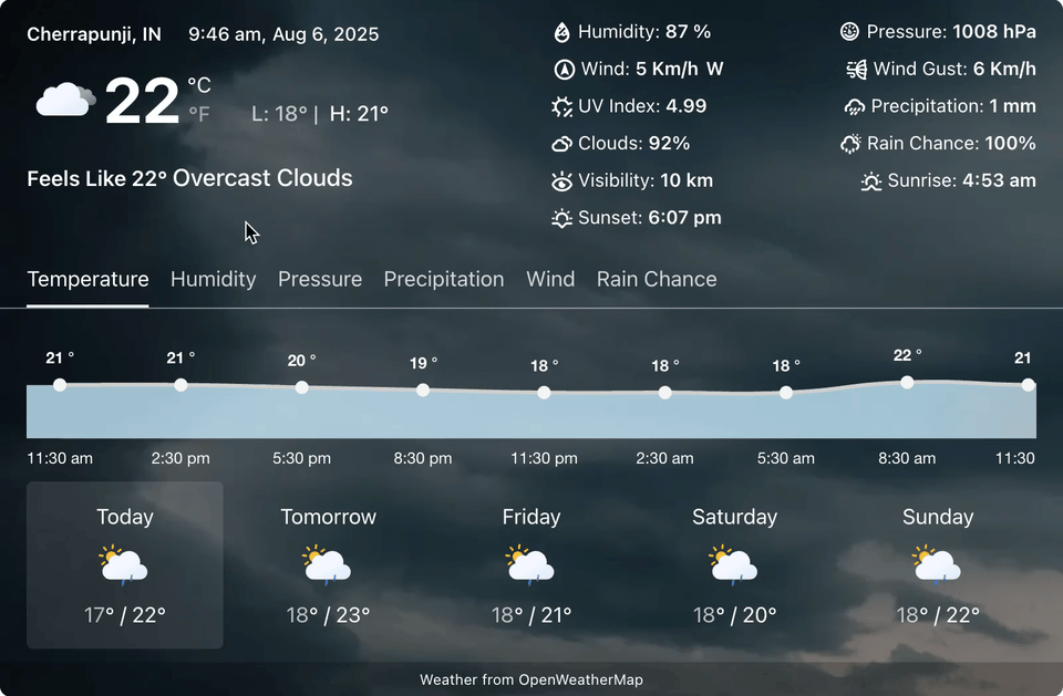
3. Now, scroll down a bit, and you will see the Weather Graph Chart toggle option. Please enable it. Done? Congratulations!
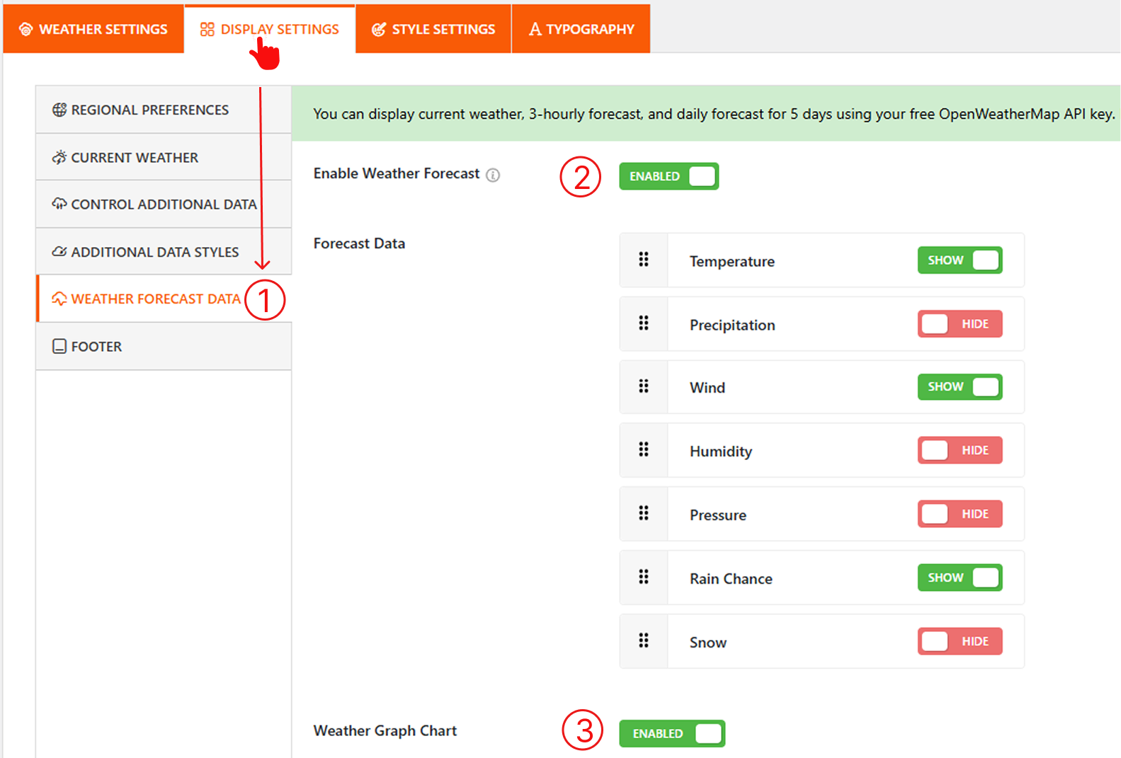
Now, proceed to select and customize your desired Display Type, Style, Colors, and weather information as needed (e.g., hourly or daily forecast).
Step 5: Publish and Embed the Shortcode
- Once you’ve completed everything, click the Publish button.
- Copy the generated Shortcode and paste it on any page, post, or widget area that works with block editors and page builders, too.
Would you like to see what the final output would be? Let’s play the included video below.
Final Thoughts
Ready to impress your visitors? Download the Location Weather today and bring your forecasts to life with dynamic weather graph charts, making your WordPress site not only informative but also unforgettable.


Leave a Reply